Big Jug Productions


Monday 26 April 2010

Evaluation

For the final part of my opening clip, i am going to simply answer some questions as a conclusion to the whole peice.
1. In what ways does your media product use, develop or challenge forms and conventions of real media products?

In our opening sequence we wanted to establish characterisation, setting, genre, narrative as well as vistual style and even ideology. In our opening clip to establish the setting, we start off opening the door to the room where she is being held, it doesn'f focus on the the room, but in the background all you can see is furniture covered by sheets, which automatically gives you the sense of the house being abbandoned. To establish the genre of our opening clip, the way we see amy in the clip helps that, seeing her tied up and covered in blood shows that it obviously a horror genre or torture porn. There isnt a lot of charactisation in our opening clip, as she barely talks, we dont know where she is from, who she is etc, but there is a great deal of ideology going on in our first clip, as Amy looks vunerable and innocent, and she appears to have been attacked and abused, so obviously we tend to take her side.
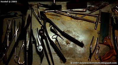
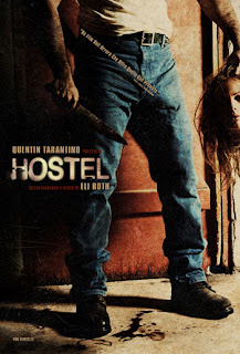
This is a screen grap from a part in Hostel - as you can see it looks very similar to a shot in our own media clip just before Amy grabs the knife, we liked this clip becuase it spooked me as the audience and i felt it added to the drama of the situation and i wanted the audience of our media clip to feel that.
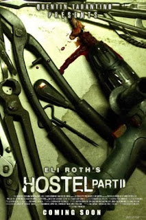
This is a screen grab from Hostel part ll - As you can see it is not exactly similar to the shot in our clip where amy is screaming for help at the front door, but they are very a like, while she is screaming for help at a gated door, Amy was begging to be freed at the front door, even though they are a lot a like it is obvious that they are shot at different angles, so that is what makes ours different to Hostel.

2. How does your media product represent particular social groups?

Our opening clip, doesn't really represent any particular social group. Amy just represents an average girl in her late teens, but obviously we do not know why she has been put here. Amy is just an average girl, she's pretty with and up to date hair cut so she obviously takes care of herself. She was put in a white dress because the white helps with the innocent vunrable apperance that we wanted to create. This helps with our target audience, as she is an average girl in her late teens, and that is who is included in our target audience.

3. What kind of media institution might distribute your media product and why?

We have made a very very low budget independant British film. It is very far from a Hollywood Blockbuster. A media idustry that may distribute our media clip would be Film4. Film4 is a free digital channel that shows only films. It ranges from hollywood big screen blockbusters to low budget independant low budget films that they have sponsered including, SlumDog Millionaire, The Lovely Bones, Happy Go Lucky And Nowhere Boy. So we would have an institution like Film4 to produce and screen our low budget independant film.


4. Who would be the audience for your media product?

The audience for our media clip is someone in there late teens and above this is because we rated our film as an '18' due to the swearing and violent nature of the film. It is for any gender, its not to be specifically directed at just men or just women, anyone can watch it. You don't have to be of a certain subculture like 'emo', 'goth', 'chav', 'indie kid' or anything else to watch it, its not aimed at anyone in particular, but a strong stomach may be needed. The genre as i have said before is 'Toture Porn' so this type of genre probally has a very selective audience as it may not be to everyones taste and preference.
5. How did you attract/address your audience?

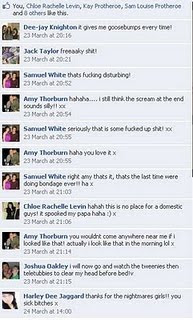
To get feedback about our opening clip we decided to go round and ask about 20 of our friends in and out of school and family members to see what they thought to our opening clip. As a result of that i have a couple graphs and charts that will show evidence of their answers. I also have the responses that friends and family posted on our opening clip from a social networking sight.
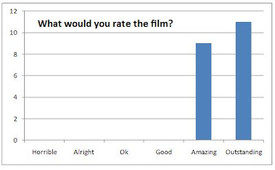
One question i asked was 'What would you rate the film?' They had a choice of: Horrible, Alright, OK, Good, Amazing or Outstanding. And much to our satisfaction the results from this question were very very pleasing. 9 of the 20 we asked rated it as 'Amazing' while the remaining 11 thought it was 'Outstanding' that means we did a great job with the film, we as editors producers directors etc know that it wasn't perfect, but as long as the audience is pleased thats all that counts.
Another question we asked was 'Would you carry on watching if there was the rest of the film?' They had a choice of: 'Noway', 'Maybe', 'I guess so', 'Yes Please' or 'Give me more'. One person voted for 'I guess so' which is understandable as our clip is not to everyones cup of tea, but 7 went for 'yes please' while the remaning 12 of the 20 said 'give me more'. This once again is what every film maker wants to hear. It is also very encouraging to hear this and get this kind of responce, i just wish we could of carried it on.
The final peice of audience responce is the feeback comments left on the social networking sight, as i explained in an earlier post, these are just the type of reactions and comments we set out to get when we were producing andediting the clip.


6. What have you learnt about technologies from the process of constructing the product?

What i have learnt about technologies during the process of constructing our media product, is there is a lot more to it than there looks. It is all very intreaging as well looking at how it works and what amazing and creative things you can create, specially with editing, and how you can make almost anything flow together and for example merging 2 images together gives the idea and thought that time has passed, just simply by merging you can create a great effect. I also learnt that a lot comes into just looking for the right location, thinking if the lighting is right there, how the lay out, where would we get the shots we needed etc. We have also watched and researched the actor and director Eli Roth, talking about his past films that he has directed and sort of commentaries that he has created about the films for example why he chose certain locations etc.

7. Looking back to your preliminary task, what do you feel that you have learnt in the progression from it to the full product?
Looking back and watching our preliminary task - it seems so basic to what we created this time round and what we have learnt now. I think its great how we had the chance to do the preliminary first to get a feel for story boarding, choosing locations and actors/actresses, choosing certain angles we woud like the scenes shot at and the dialouge. We learnt that we can't also film everything the way we want it. In the preliminary task we used simple angles and shot and simply let it flow one after the other, not having to do a lot of editing at all. But when it came to the main task we thought about being a little more adventorous and experimental with the angles we would shoot scenes, and if it didnt work, we would try something else. It was also a lot more challenging when we tried to make it flow together and fit from one scene to the other, as we learnt while editing. We had to try things that were totally new to us when editing, we used grey scale and added text onto the clip, we also took a sound from one clip and added it to another clip in the scene, something that wasnt nessacery in the preliminary. So my knowledge has widely expanded from what i knew filming and editing our preliminary task to what i know about filming and editing.

Sunday 25 April 2010

Changes

Some of the Changes we made while filming and editing:

Filming: We were origanally going to film from Amy's point of view when she came round from being unconcisous, but we found that too hard to film and look realistic, so we thought it would look much better if we just filmed her actually coming roud.

We also decided that filming inbetween the bars of the stair rail would look really affective in the situation we created. It shows that after looking so weak and vunrable, she now has regained some power.


We also had a spare of the moment idea to film a shot from outside the window, this would make Amy look more trapped and vunrable, and luckily it paid off, and looks really affective, it also gives the audience a chance to see her emotions up close.

We also changed an idea that was do start off with a shot of '337' then go through the house to find Amy, but we thought that would take up to much time and wouldnt give us a chance to get as many angles in, so we saved the '337' shot till the end.

Editing: We didnt no if we were going to merge some of the shots while we were filming them but while editing and looking through the shots we felt that some of them need merging, and in some cases the merging gives the sense of time passing.
This is an example a merging shot....

The shot where the camera is above the bed watching Amy untying her leg, was just a normal shot, but we felt that we wanted to creep the audience out more, so we changed it to look like a CCTV camera as if he was watching her.


Another edit we made was editing the sound, there was one part where there was accidental rustling in the background, so we had to cut that sound out, take some 'heavy breathing' sounds from another part of the clip and place there aswell, it took us a couple tries to find a suitable sound clip, but luckily we were able to find one that fits and matches the actions in the scene.

To edit our opening sequence we used an editing programme called Sony Vegas Pro which is a software that enables you to edit things which can produce effective media techniques such as fades and filters. The editing software really helped us to create our opening sequence, while also teching us how to use different media techniques in our sequence. When it came to editing thats where i shone best, i felt really good and really comfortable editing our peice to create a master peice.


After completeing our opening clip, we wanted some feed back, so we uploaded the video to a social networking sight 'Facebook', so all our friends and family could view it and give us feedback. I also showed my family and i was given comments from them such as 'i had goosebumps upon goosebumps' 'It seems so real' and 'it was gripping' all these are very flattering comments. Here are some comments that we recieved off 'Facebook'.


Friday 16 April 2010

The Main Plot

The Plot: We start off with the door opening and see this half dead girl laying unconsious on a bed, her clothes ripped apart covered in blood. The camera comes through the door and comes right into a face, the camera stays as a close up as she begins to come round then slightly then moves out from a close up and she starts to realise where she is and begins to panick, in the shot we get her head turning and begining to start trying to untie her hand. The shot changes to a view of her hands, one is tied up and the other is tryin to free it. After her hands are free, the camera swaps to a high shot looking down on the bed, this shot is to look like a point of view from a CCTV camera as if the physco is watching his victim. So as the camera watches her from above she is untying her foot, then crawling off the bed and heading towards the window underneath the camera. The shot changes to a side mid shot of the window where Amy comes up to the window in a panic, and as she throughs back the curtains she lets our a horrific scream. As she begins to work herself up into a worse state, she runs upto the window and starts screaming, swearing and hitting the window. The camera changes to outside of the window looking in at Amy still hitting and banging the window while she cries and screams. As she backs away from the window, in a mid shot she tries to calm herself down and turns to see the bloody tools laying there on the side. She walks over and begings handling some, a close up shot of the tools shows Amy's hands picking up the knife, zooming out, she starts mumbling to herself, then screams out loud and storms over to the door as the camera follows over her shoulder. See it from Amy's point of view she slowly twists the door knobs and the door opens. Creeping out of the doorway, the camera is placed at a low shot inbetween the stair rails as she looks around and continues towards the stair case. We then see Amy run down half of the stairs, with the camera being at the top of the stairs, she stops half way down and begins to sob and have a final look around, still in the same spot the camera is now in a high shot looking up at on the stairs, then she turns and continues to run down the other half of the stairs. The camera changes to the point of view of the physco, walking down the stairs slowly towards Amy as she is backed against a window next to the front door. Begging him to let her go and screaming at him she drops the knife as he gets even closer. As she is fully against the window, crying her eyes out, the camera has moved outside and sees the back of her head and hands sliding slowly down the window as she lets out a scream. While her heads and hands drag down the window the shot merges showing the number on the house, 337.

THE END.

Thursday 15 April 2010

Planning Stage.

Location: For our location we chose to use Gemma King's Home in Werrington, we thought this would be the perfect location to film our opening sequence. This is becuase her room and the parts of the house we wanted to use are not overly decorated, so basically her walls weren't pink green and orange, they were all a good plain colour. Through the hallways and stair ways there was minor decoration like a mirror and a couple of hanging paintings, these were easy to remove so we could give off the abandoned house feel. Gemma's room was good to becuase if was a good plain colour and had wooden floors and a good layout by the way the bed was to the door and the windows. Everything was easy to move out of her room and furniture we couldnt move like the wardrobe and sets of draws we covered with my old sheets that are used to cover furniture when redocerated, this also adds to the abondaded house feel. The outside of the house was perfect aswell because it wasnt over fancy it just looked like a normal house, and just by chance had a creepy looking house number '337'.


Props: We used quite a lot of props in this piece. Inside the house we had the old painting sheets to cover the funrniture, some alreadt came with (paint) splatters on which fitted in perfectly becuase they were brown we could hint the fact it was dried blood from previous victoms. We also had, which we show a shot of, power tools and knife and anything that looks like a physco would use to dismember a body, to give them the covered in blood, old and disgusting look, me and Gemma took outside covered them in mud (which was fun!!) then covered some in fake blood and food colouring.


Lighting: For lighting, we decided not to use any lighting boards or any extra lamps in our opening clip because we thought the natural light would look more authentic. Plus we want our clip to look as natural as possible but also slightly dark, but lucky for us Gemma has big dark curtains in her room so they worked perfectly blocking out enough light, and then when Amy opens the curtains, it looks like normal day time, that helps makes it seam freaky becuase of the state she is in.


Dialogue: For our opening clip we didnt really write a script for Amy to follow, so we just kind of gave her a quideline of what we would like to say and let her role with it. We did tell her that we would like her to swear in the clip becuase that would make it more dramatic becuase Amy shouting 'You Fucker' sounds a lot better than 'You Idiot' or something like that. There isnt a lot of key dialouge in our clip, just her talking to her self like when she says 'Come on then, COME ON THEN' we thought that was good becuase she kind of says it as a mumble to herself then screams it aloud and while saying that she is looking at the knife, this shows how mental this hole situtation has driven her. Amy also added in some dialouge her self, like the part at the end when she is at the bottom of the stairs and we thought it was soo good that we decided to go with it.


Costume:


This is the costume that Amy had to wear to make everything looks convincing. Yes you looks slighty gross and quite scary, but the hole costume looks quite realistic. First of all we started ripping apart her dress, we told her to wear a white dress becuase it adds a sense of vunrability and innocence. We made several tears and slits, broke the zip, and rip part of it off at the bottom as you can see! So make the blood looks slightly dry as if she has been there for a while we put a base of mud underneath the blood to give it that brown dry affect. We smeared it across her chest, back, arms and legs. We also splattered it across her dress and especially around the area's where the dress was cut to make it look like he cut her while she wearing the dress. We will also applied the fake blood around her nose and mouth, this is to influence the fact that she has been badly beaten by this physco. To make her look more beaten we put dark make up around her eyes to look like black eyes and that she has been there for quite a while. A great idea Daisy came up with was to make her hair look greasey so we rubbed baby oil on our hands and run our hands through her hair. So over all we thought Amy looked quite convincing as a victim of a violent attack. We were quite pleased how she pulled it off, and her costume played a big part in setting the scene.


Actress:

This is our beautiful beautiful actress, Amy Thorburn, she was also used in our preliminery video, and we thought she was sooo amazing in our first one, that we would use her in our opening clip. And we were right to choose her becuase she was fantastic, and she got totally into character and made it so believeable. She was spine tingling awsome.


Risk Assesment


Thursday 25 March 2010

Research

As part of our research for our opening clip, we looked at severeal different opening scenes and clips from TV shows and films that fit with our chosen Genre of Torture Porn. We have selected some films that we believe are suitable and can give a good insight into our genre and some new ideas to our opening clip.

We decided on the Genre of Toture Porn because we believe it gave us a lot of freedom as directors, and it was a lot of fun to come up with possible ideas and scenes for our clip, and it let us get very creative adding a lot of imagination into it.

Torture Porn
Since the 2000's there has been a resurgence of films influenced by the 'splatter genre' that depict nudity, torture, mutilation and sadism, labeled by critics as 'Torture Porn'. Eli Roth's Hostel (2005) was the first to be catagorised as 'Torture Porn'. So the genre is quite new to the film industry, althought past films such as Saw and its sequals have been labbeled as Torture Porn but the creators disagree with this. 'Torture Porn' is starting to become very popular and very profitable


Hostel Part I


Hostel is a 2005 horror film written, produced and directed by Eli Roth, this being one of the first films that started off the 'Torture Porn' genre. This film takes blood and gore to the max, so much that it's showing has been restricted in certain countries. The movie takes place in Slovakia, where three college students visit a hostel, where they think that all of their sexual fantasies will come true. Instead, they find an international syndicate with the express purpose of torturing and killing backpackers for the sadistic pleasures of rich businessmen. This film does not hold back when it comes to bloody scenes, they show you everything! This is why we chose to look at it: to see how we could film our own bloody scenes with out it looking cheesey, cheap and not high quality, also becuase they show you in depth the characters emotions and this is quite an emotional clip and we thought we could take ideas from this and re-work them for our own.


Hostel Part II
Hostel: part 2 pretty much has the same story line as Hostel part 1 where rich business men and women all place bets on random people (usually back packers) to kill in any way they please. This ones follows a group of 3 girls backpakcing acorss europe when a stranger invites them to the village party that is held every year, little did they know they would be lead to their death. One of the girls meets a guy along the way and he ends up a victim just like the most of the girls. To the viewers suprise one girl manages to escape, but the only way you are allowed out of the building is to kill someone, so she ends up killing the man you tries to kill her. This film takes gory scenes to the max, making you cringe in your seat and cover your eyes, but you can't stop watching! The way that the killers used their tools in this film really inspired us into using the theme of muderous household weapons like hammers, drills etc. You can tell we used this idea becuase in our clip their is a shot of the tools covered in blood which almost looks similar to the Hostel: Part ll advertising poster.


Eli Roth
Eli Raphael Roth (born April 18, 1972) is an American film director, producer, writer and actor. He is part of the group of filmmakers dubbed the Splat Pack, because of their association and their focus on the horror genre. Roth is known for making violent, low-budget horror films that are box office hits worldwide, and for bringing back the R-rating to horror at a time when studios believed only PG-13 horror would work. In January 2006, film critic David Edelstein in New York Magazine credited Roth with creating the horror sub-genre 'torture porn,' or 'gorno,' using excessive violence to excite audiences like a sexual act. Roth has said he hates the term, and feels it is far more reflective of the critics who use it and their lack of understanding of the genre than of the films themselves.


Cut! Take Two

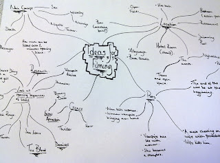
We origanally had the idea to go with a Vampire theme, so we did all the research on Vampire shows and films, wrote out the story board, planned the whole thing out, bought all the probs and stayed up till 11 at night filming it. So the next day at school we began to edit what we thought would be a 'master pieceee' and it looks like a massive mess and a massive fail!!!!!
So we cut it all! & started a fresh - new idea, new location, new actors, new everything so here it goes - Take Two!

Wednesday 24 February 2010

New York.


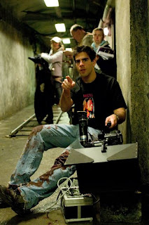
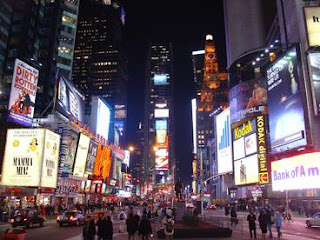
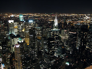
As part of enrolling in this Media AS Course we were offered the chance to gone a 4 day trip to the city of NEW YORK in the USA. This trip was amazing. We learnt a lot along with having a good time! We had a 4 hour media workshop where we learnt to film act and edit. We learnt about techniques used in the filiming industry like special tricks with lighting (lighting boards) than can be simply made at home. We were taught about the Camera's how they work and how the film works and digital cameras and what is best to have. We were split into groups and each group got the chance to film their own scene. When it was my groups turn to film i was the actress but also learnt things about Directing and the Snap/actionBoard etc. We also got the chance to go on a Film tour around New York, we saw loads of different locations of some of our favourite TV shows and films including Sex and the City, Ugly Betty, I Am Legend and Coyote Ugly. And ofcourse we got to do some shopping in Times Square/5th Avenue etc. but overall New York was a fabulous experience -Take Me Backk!!